About Us > Наш логотип
Logo & Brand
Наш логотип
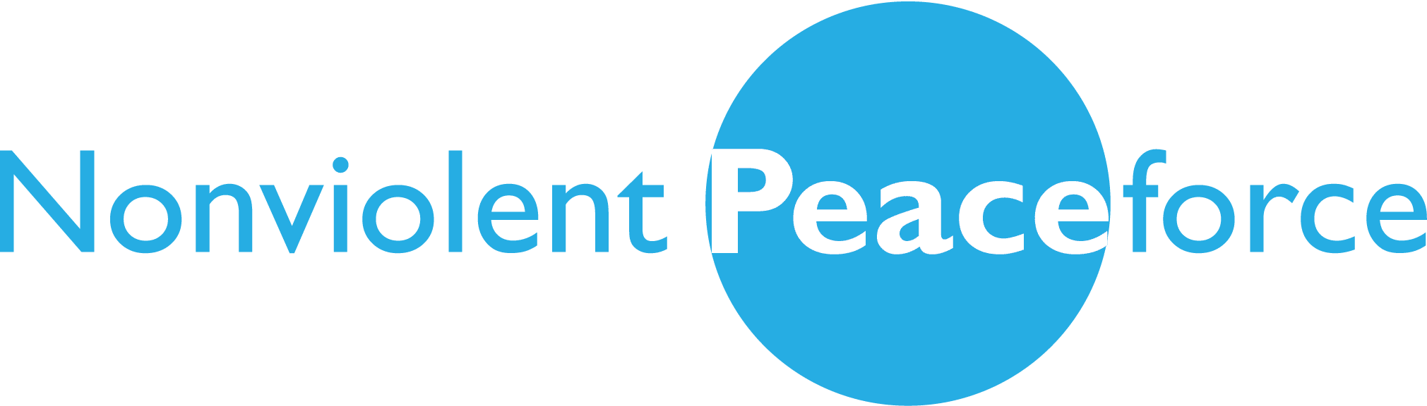
The orange and blue brand colors show balanced opposites. The open P invites you to join in creating a community solution and also represents breaking the cycle of (generational) violence together. Through shared understanding and connection (shown by the connected stem of the N and P), peace can grow from nonviolence.
NP’s abbreviated logo was created with digital-first environments in mind, such as social media, where the acronym and bold brand colors will provide better logo integrity and brand awareness in a smaller space.
When to Use Each Logo
When you need your logo for something printed in full color, use one of the files with CMYK in the name. Examples: Print collateral, product giveaways
When you need your logo for online use, whether to place on a website or on social media, use one of the files with RGB in the name. Examples: Logo on website, social media content
When you need your logo in black only, perhaps to save on budget for a giveaway item, use one of the files with K in the name.
When you need your logo in white only, because it will be up against a color or black background, use one of the files with W in the name.
Guidelines for Logo Use
Community partners are welcome to use our logo, we trust that you will use our logo in an appropriate manner. Please tag NP on social media posts. For more information, see our full guide for logo and brand guidelines.
Abbreviated Logo
PNG File
Nonviolent Peaceforce Abbreviated Logo: RBG
PNG File
Nonviolent Peaceforce Abbreviated Logo: CMYK
JPG File
Nonviolent Peaceforce Abbreviated Logo: RBG
Abbreviated Logo: White & Black

PNG File
Nonviolent Peaceforce Abbreviated Logo: White
PNG File
Nonviolent Peaceforce Abbreviated Logo: Black
JPG File
Nonviolent Peaceforce Abbreviated Logo: Black
Full Logo
PNG File
Nonviolent Peaceforce Full Logo: Blue
PNG file
Nonviolent Peaceforce Full Logo: Black

PNG File